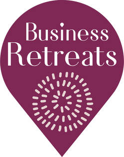
 Earlier this year Business Retreats Australia employed a Melbourne based graphic design business, Sun Shiny Design, to create a new Corporate Identity. Corporate identity is the visual face of your business or brand. It should reinforce your company values and what you stand for. The challenge for Business Retreats was to create a fresh image that is relevant and contemporary. Business Retreats is an established business which has had a logo that has served them well for many years. The new direction aims to build on their existing heritage and create a new, fresh and exciting strategy that reflects where Business Retreats sits in a marketplace that is ever more sophisticated and discerning. The first stage in any logo development is the brief. Finding the right design solution to a problem starts with first of all asking the right questions. Felicity and her team worked through a comprehensive process where they identified the brand's key messages and created a mood board before embarking upon the process of communicating that message visually.
Researching is the next element in understanding how to answer the brief in the best possible way. This involves understanding how our business operates, who our clients are and what does the marketplace look like and who are our competitors. This step is critical in developing a message and look that stands out for all the right reasons. Once Felicity and her team had understood all the information, they were able to start designing. This part of the process is where the magic happens. Brain storming, experimentation and trial and error are all critical elements in coming up with ideas. Exploring typefaces, colours, textures, images and being open to "happy accidents" helped shape the range of ideas they presented to Katarina, our CEO. After presenting a first draft to Business Retreats, the team embarked on a backwards/ forwards collaboration process that saw one of the ideas presented in Draft 1 evolve into the finished logo pictured above. The “drop pin” shape communicates Business Retreats focus on finding the right venue for our clients and the hand drawn circular pattern represents people “coming together” metaphorically and physically as in a conference or retreat. The clean lines of the drop pin provide a strong silhouette that shows professionalism and reliability and the looser lines of the circle contrast with that, showing human, fun and personal qualities. The typeface is clean and elegant with a subtle reinforcement of the pin drop in the “dot” of the “i”. Felicity Forrester from Sun Shiny Design would like to congratulate our Director, Katarina on her openness to ideas and flexibility in her approach which has allowed Felicity and her team to create a unique and individual logo that communicates clearly. Felicity is proud of the finished product as it answers the original brief clearly and concisely. The process of implementing the logo across the website and general collateral will be a gradual roll out over the next months, however, Felicity looks forward to hearing the feedback as this takes place. Comments are closed.
|
Categories
All
Archives
April 2020
|
